
無障礙訪問
Web 無障礙訪問 (也稱為 a11y) 是指創建可供任何人使用的網站的做法——無論是身患某種障礙、通過慢速的網絡連接訪問、使用老舊或損壞的硬件,還是僅處於某種不方便的環境。例如,在視頻中添加字幕可以幫助失聰、有聽力障礙或身處嘈雜環境而聽不到手機的用戶。同樣地,確保文字樣式沒有處於太低的對比度,可以對低視力用戶和在明亮的強光下使用手機的用戶都有所幫助。
你是否已經準備開始卻又無從下手?
請先閱讀由萬維網聯盟 (W3C) 提供的 Web 無障礙訪問的規劃和管理。
跳過鏈接
你應該在每個頁面的頂部添加一個直接指向主內容區域的鏈接,這樣用戶就可以跳過在多個網頁上重複的內容。
通常這個鏈接會放在 App.vue 的頂部,這樣它就會是所有頁面上的第一個可聚焦元素:
template
<ul class="skip-links">
  <li>
    <a href="#main" ref="skipLink" class="skip-link">Skip to main content</a>
  </li>
</ul>
若想在非聚焦狀態下隱藏該鏈接,可以添加以下樣式:
css
.skip-link {
  white-space: nowrap;
  margin: 1em auto;
  top: 0;
  position: fixed;
  left: 50%;
  margin-left: -72px;
  opacity: 0;
}
.skip-link:focus {
  opacity: 1;
  background-color: white;
  padding: 0.5em;
  border: 1px solid black;
}
一旦用戶改變路由,請將焦點放回到這個“跳過”鏈接。通過如下方式聚焦“跳過”鏈接的模板引用 (假設使用了 vue-router) 即可實現:
vue
<script setup>
import { ref, watch } from 'vue'
import { useRoute } from 'vue-router'

const route = useRoute()
const skipLink = ref()

watch(
  () => route.path,
  () => {
    skipLink.value.focus()
  }
)
</script>內容結構
確保設計可以支持易於訪問的實現是無障礙訪問最重要的部分之一。設計不僅要考慮顏色對比度、字體選擇、文本大小和語言,還要考慮應用中的內容是如何組織的。
標題
用戶可以通過標題在應用中進行導航。為應用的每個部分設置描述性標題,這可以讓用戶更容易地預測每個部分的內容。說到標題,有幾個推薦的無障礙訪問實踐:
- 按級別順序嵌套標題:
<h1>-<h6> - 不要在一個章節內跳躍標題的級別
- 使用實際的標題標記,而不是通過對文本設置樣式以提供視覺上的標題
template
<main role="main" aria-labelledby="main-title">
  <h1 id="main-title">Main title</h1>
  <section aria-labelledby="section-title-1">
    <h2 id="section-title-1"> Section Title </h2>
    <h3>Section Subtitle</h3>
    <!-- 內容 -->
  </section>
  <section aria-labelledby="section-title-2">
    <h2 id="section-title-2"> Section Title </h2>
    <h3>Section Subtitle</h3>
    <!-- 內容 -->
    <h3>Section Subtitle</h3>
    <!-- 內容 -->
  </section>
</main>
Landmarks
Landmark 會為應用中的章節提供訪問規劃。依賴輔助技術的用戶可以跳過內容直接導航到應用的每個部分。你可以使用 ARIA role 幫助你實現這個目標。
| HTML | ARIA Role | 地標的目的 |
|---|---|---|
| header | role="banner" | 主標題:頁面的標題 |
| nav | role="navigation" | 適合用作文檔或相關文檔導航的鏈接集合 |
| main | role="main" | 文檔的主體或中心內容 |
| footer | role="contentinfo" | 關於父級文檔的信息:腳註/版權/隱私聲明鏈接 |
| aside | role="complementary" | 用來支持主內容,同時其自身的內容是相對獨立且有意義的 |
| search | role="search" | 該章節包含整個應用的搜索功能 |
| form | role="form" | 表單相關元素的集合 |
| section | role="region" | 相關的且用戶可能會導航至此的內容。必須為該元素提供 label |
提示:
建議同時使用 landmark HTML 元素和 role 屬性,以最大程度地兼容不支持 HTML5 語義元素的傳統瀏覽器。
語義化表單
當創建一個表單,你可能使用到以下幾個元素:<form>、<label>、<input>、<textarea> 和 <button>。
標籤通常放置在表格字段的頂部或左側:
template
<form action="/dataCollectionLocation" method="post" autocomplete="on">
  <div v-for="item in formItems" :key="item.id" class="form-item">
    <label :for="item.id">{{ item.label }}: </label>
    <input
      :type="item.type"
      :id="item.id"
      :name="item.id"
      v-model="item.value"
    />
  </div>
  <button type="submit">Submit</button>
</form>
標籤
提供標籤來描述所有表單控件的用途;使 for 和 id 鏈接起來:
template
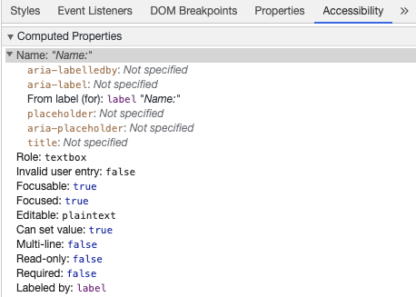
<label for="name">Name: </label>
<input type="text" name="name" id="name" v-model="name" />
If you inspect this element in your Chrome DevTools and open the Accessibility tab inside the Elements tab, you will see how the input gets its name from the label:
警告:
你可能還見過這樣的包裝 input 框的標籤:
template
<label>
  Name:
  <input type="text" name="name" id="name" v-model="name" />
</label>
但我們仍建議你顯式地為 input 元素設置 id 相匹配的標籤,以更好地實現無障礙訪問。
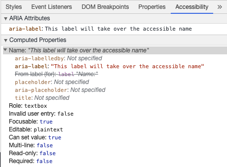
aria-label
你也可以為 input 框配置一個帶有 aria-label 的無障礙訪問名。
template
<label for="name">Name: </label>
<input
  type="text"
  name="name"
  id="name"
  v-model="name"
  :aria-label="nameLabel"
/>
aria-labelledby
使用 aria-labelledby 類似於 aria-label,除非標籤文本在屏幕上可見。它通過 id 與其他元素配對,你可以連結多個 id:
template
<form
  class="demo"
  action="/dataCollectionLocation"
  method="post"
  autocomplete="on"
>
  <h1 id="billing">Billing</h1>
  <div class="form-item">
    <label for="name">Name: </label>
    <input
      type="text"
      name="name"
      id="name"
      v-model="name"
      aria-labelledby="billing name"
    />
  </div>
  <button type="submit">Submit</button>
</form>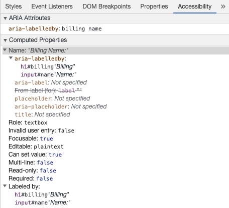
aria-describedby
aria-describedby 的用法與 aria-labelledby 相同,它提供了一條用戶可能需要的附加描述信息。這可用於描述任何輸入的標準:
template
<form
  class="demo"
  action="/dataCollectionLocation"
  method="post"
  autocomplete="on"
>
  <h1 id="billing">Billing</h1>
  <div class="form-item">
    <label for="name">Full Name: </label>
    <input
      type="text"
      name="name"
      id="name"
      v-model="name"
      aria-labelledby="billing name"
      aria-describedby="nameDescription"
    />
    <p id="nameDescription">Please provide first and last name.</p>
  </div>
  <button type="submit">Submit</button>
</form>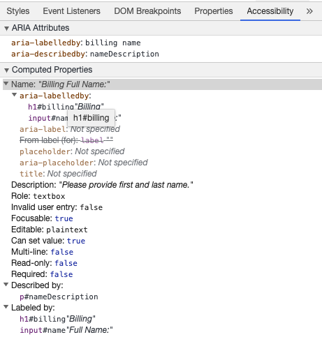
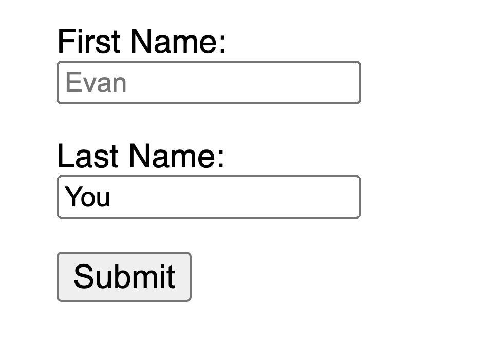
佔位符
避免使用佔位符,因為它們可能會使許多用戶感到困惑。
佔位符的缺陷之一是默認情況下它們不符合顏色對比度標準;應當修改其顏色,讓它看起來像是預先填入 input 框中的數據一樣。查看以下示例,可以看到滿足顏色對比度條件的姓氏佔位符看起來像預填充的數據:
template
<form
  class="demo"
  action="/dataCollectionLocation"
  method="post"
  autocomplete="on"
>
  <div v-for="item in formItems" :key="item.id" class="form-item">
    <label :for="item.id">{{ item.label }}: </label>
    <input
      type="text"
      :id="item.id"
      :name="item.id"
      v-model="item.value"
      :placeholder="item.placeholder"
    />
  </div>
  <button type="submit">Submit</button>
</form>
css
/* https://www.w3schools.com/howto/howto_css_placeholder.asp */

#lastName::placeholder {
  /* Chrome, Firefox, Opera, Safari 10.1+ */
  color: black;
  opacity: 1; /* Firefox */
}

#lastName:-ms-input-placeholder {
  /* Internet Explorer 10-11 */
  color: black;
}

#lastName::-ms-input-placeholder {
  /* Microsoft Edge */
  color: black;
}
最好在表單外提供所有用戶需要填寫輸入的信息。
用法說明
添加用法說明時,請確保將其正確鏈接到目標 input 框。你可以提供附加用法說明並在 aria-labelledby 內綁定多個 id。這可以使設計更加靈活。
template
<fieldset>
  <legend>Using aria-labelledby</legend>
  <label id="date-label" for="date">Current Date: </label>
  <input
    type="date"
    name="date"
    id="date"
    aria-labelledby="date-label date-instructions"
  />
  <p id="date-instructions">MM/DD/YYYY</p>
</fieldset>
或者,你可以通過 aria-describedby 將用法說明附加到 input 框上。
template
<fieldset>
  <legend>Using aria-describedby</legend>
  <label id="dob" for="dob">Date of Birth: </label>
  <input type="date" name="dob" id="dob" aria-describedby="dob-instructions" />
  <p id="dob-instructions">MM/DD/YYYY</p>
</fieldset>
隱藏內容
通常,即使 input 框具有無障礙的名稱,也不建議在視覺上隱藏標籤。但是,如果可以藉助周圍的內容來理解輸入的功能,那麼我們也可以隱藏視覺標籤。
讓我們看看這個搜索框:
template
<form role="search">
  <label for="search" class="hidden-visually">Search: </label>
  <input type="text" name="search" id="search" v-model="search" />
  <button type="submit">Search</button>
</form>
現在,只要視力情況良好,用戶可以就能通過按鈕的內容識別出該 input 框的目的。
此時我們可以使用 CSS 從視覺上隱藏元素,同時也不會影響到無障礙訪問:
css
.hidden-visually {
  position: absolute;
  overflow: hidden;
  white-space: nowrap;
  margin: 0;
  padding: 0;
  height: 1px;
  width: 1px;
  clip: rect(0 0 0 0);
  clip-path: inset(100%);
}
aria-hidden="true"
添加 aria-hidden="true" 在無障礙訪問時被隱藏,但對其他可視用戶仍然是可見的。不要在可聚焦的元素上使用它,請只在裝飾性的、重複的或屏幕外的內容上使用它。
template
<p>This is not hidden from screen readers.</p>
<p aria-hidden="true">This is hidden from screen readers.</p>
按鈕
在表單中使用按鈕時,必須設置類型以防止提交表單。 你也可以使用一個 input 元素來創建按鈕:
template
<form action="/dataCollectionLocation" method="post" autocomplete="on">
  <!-- 按鈕 -->
  <button type="button">Cancel</button>
  <button type="submit">Submit</button>

  <!-- 輸入按鈕 -->
  <input type="button" value="Cancel" />
  <input type="submit" value="Submit" />
</form>
功能圖片
你可以使用這種方式來創建一個帶有功能的圖片。
input 框
- 這些圖片會像一個類型為 submit 的表單按鈕一樣
template<form role="search"> <label for="search" class="hidden-visually">Search: </label> <input type="text" name="search" id="search" v-model="search" /> <input type="image" class="btnImg" src="https://img.icons8.com/search" alt="Search" /> </form>圖標
template
<form role="search">
  <label for="searchIcon" class="hidden-visually">Search: </label>
  <input type="text" name="searchIcon" id="searchIcon" v-model="searchIcon" />
  <button type="submit">
    <i class="fas fa-search" aria-hidden="true"></i>
    <span class="hidden-visually">Search</span>
  </button>
</form>
規範
萬維網聯盟 (W3C) Web 無障礙訪問倡議 (WAI) 為不同的組件制定了 Web 無障礙性標準:
- 用戶代理無障礙訪問指南 (UAAG)
- 瀏覽器和媒體查詢,包括一些其他方面的輔助技術
- 創作工具無障礙訪問指南 (ATAG)
- 創作工具
- Web 內容無障礙訪問指南 (WCAG)
- 網站內容 - 由開發者、創作工具和無障礙訪問評估工具使用。
網絡內容無障礙指南 (WCAG)
WCAG 2.1 繼承自 WCAG 2.0,接納 Web 演進過程中的新技術。W3C 鼓勵在開發或更新 Web 無障礙訪問策略時使用 WCAG 的最新版本。
WCAG 2.1 四大指導原則 (縮寫 POUR):
Web 無障礙倡議 – 無障礙訪問豐富的互聯網應用 (WAI-ARIA)
W3C 的 WAI-ARIA 為如何構建動態內容和高階用戶界面控件提供了指導。
資源
文檔
- WCAG 2.0
- WCAG 2.1
- Accessible Rich Internet Applications (WAI-ARIA) 1.2
- WAI-ARIA Authoring Practices 1.2
輔助技術
測試
- 自動化相關的工具
- 顏色相關的工具
- 其他有用的工具
用戶
世界衛生組織估計,全世界 15% 的人口患有某種形式的殘疾,其中約 2 - 4% 的人嚴重殘疾。估計全世界有 10 億殘障人士,他們是世界上最大的少數群體。
殘疾的種類繁多,大致可分為以下四類:
- 視覺 - 可以為這些用戶提供屏幕助讀器、屏幕縮放、控制屏幕對比度或盲文顯示等幫助。
- 聽覺 - 可以為這些用戶提供視頻字幕、文字記錄或手語視頻。
- 運動能力 - 可以為這些用戶提供一系列運動障礙輔助技術:比如語音識別軟件、眼球跟蹤、單刀式開關、超大軌跡球鼠標、自適應鍵盤等等。
- 認知能力 - 可以為這些用戶提供補充媒體、更清晰和簡單、更結構化的內容。
你可以查看以下來自 WebAim 的鏈接,更深入地了解這些用戶的需求: